18th November 2020

Animations add life to otherwise dead objects. You can fit animations in anything and see how it attracts a massive audience. Despite the age and gender, every person gets inspired by lively sketches. A substantial reason behind most brands getting animated custom logo designs is to captivate targeted customers.
Without logos, brands in this contemporary era cannot garner any real success.
On one hand, we have custom logo designs that are a basic need to start a business. On the other hand, we have animations that add colors to life.
What if a logo design – that contains the sole purpose to entice the audience, is combined with animation – that elevates the value of every single thing. Imagine the impact it will leave on the targeted audience!
Intriguing, right?
Mashing up animation and logo designs is a surefire way to enhance the brand’s value and image. Let us tell you how:
Animated logo designs are a step ahead of the static or image-only emblems.
These emblems do not just serve the purpose of captivating the prospect’s attention. Instead, they are made with such perfection that they keep the audiences hooked up, compelling them to enjoy watching for several seconds. As a result, the design becomes memorable and serves a massive role in converting leads to customers.
Multiple companies worldwide have recognized the magic of adding animations in the logos. Hence, they are incorporating this new marketing strategy to promote their brand.
Below here are some of the famous brands that have instilled animations in their custom logo designs.

The company does not just deliver packages but also hopes. Their logo is divided into three parts. First, if you look at the animated logo of Amazon, you cannot, by any means, fail to understand the brand theme. The image showcased the word Amazon; then an arrow goes from A to Z.
The arrow shows that the company contains and delivers everything from A to Z. However, the logo does not end there.
Next, we see a smiley face. The arrow remains there, but instead of the word amazon, you can see two eyes emerging. This part signifies the ease customers have got due to their services.
Last, in the third part, we have the letter A, an arrow beneath it, the website’s link “amazon.com.”
The message behind amazon’s logo is that they sell everything from A to Z, and ensure customer satisfaction as well.
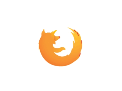
Did someone talk about minimalistic animated logos?
Well, Firefox has heard you. The famous search engine has got the simplest yet an impacting animated logo design. The colors used colors signify fire. Moreover, their brand identity is showcased by the streaming speed with which the fox is revolving.
The message we get here is that the brand provides the fastest online streaming service.

Do we really need to tell you what Google does?
Google, the name that requires no introduction, has the coolest captivating custom logo design. The animated emblem is divided into four parts.
First, it starts with the name “Google” written on the screen. Then in a split of a second, four dots of blue, red, yellow, and green color appears on the screen. These four colors are used as brand theme colors. According to the company they have used three primary colors with a secondary one, that is green. Doing so shows that the company operates with the philosophy of thinking out of the box, instead of following the same old patterns.
Next, we see in the animated logo is the symbol “G,” which is Google Chrome’s logo. Then comes the top used unique feature of Google, “mic,” enhanced technology of voice search. In the end, the four multicolored dots/circles stretch and convert into typing fingers, signifying that the search engine consists of everything you look for.

Intel – the world’s best commercial microprocessor chip making brand. Their custom logo design showcases that the company makes processing chips for tablets, computers, and mobile phones.
their animated logo that starts with a blue-colored screen, with an image of a laptop, tablet, and phone. Then the slogan of the brand, “look inside” comes on the screen. Finally, from the dot, which is basically a chip, emerges the brand’s name, and the slogan is showcased on the side.
Undeniably, the best way to showcase your unique selling point!

Animated in a piece by piece, Burger King’s logo is simple and can be understood easily by anyone who sees it.
The logo leads from a half moon-like image, which is basically the plate of serving. Then we see the brand name appearing within the two loaves of the burger.
The logo design showcases exactly what the brand is about without playing with any hidden meanings. The reason behind the simplicity is apparently because ain’t nobody got time to notice subliminal meanings when hungry.
Calling it the best BURGERY logo will not be wrong.

The world-class courier delivery service – FedEx uses the arrow to demonstrate its brand message.
In their static logo design, it was somewhat complex for a new audience to understand what the brand is about.
The hidden white arrow (which is not so hidden) is used by the brand as creative negative space usage. However, in the animated logo, the company truly shows why they have instilled the arrow between E and X. The arrow denotes that FedEx is always flying and delivering packages to the desired places.
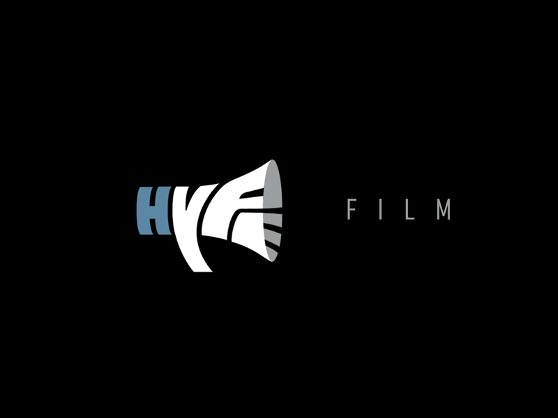
Hype film is a production house. As soon as we hear about a production house, an image of a loudspeaker appears in our brains. The creative logo design service of Hype Film has played cleverly with the word-image game.
The word film coming out as the sound from a loud-speaker simply shows that the brand is a production house.
The emblem is the perfect example of adding daring new elements to the logo animation sequence.

Pixate is a mobile app prototype brand. It consists of a black background instilled with four colorful leaves showcasing the creative side of the app.
The message given in this custom logo design is that an animated logo does not have been filled with several effects. A simple animated logo that showcases your brand identity is enough.
In this case, the brand is giving hidden meanings that, pictures combining together make pixate.

Who has not heard of Nat Geo? One of the best documentary-based channels, National Geographic, has the best iconic animated logo design. With a shiny dark-brown background has yellow borders that break up and are brought back to piece.
The message we get from this logo design that the channel does not show fake fantasies, rather they have grown out of the box and show realities.
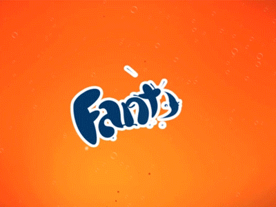
Another brand that needs no introduction is the fun and energizing brand, Fanta. The logo created by one of the best creative logo design service providers showcased the bubbly fun nature of the audience who like this drink. The orange circle shape has been brought to life with the help of animation.
The tip we can take from this logo is that use the brand’s key attributes for animation, just like Fanta’s orange circle in this case. The brand has truly lived up to the same energy it showcases.

The app that helps you reach your destination on time, wherever and whenever. In this animated custom logo design, the dots we see are building points of a map. These points are the location spots where drivers pick and drop the customers.

Which is the most reliable platform we log on to when there is a need to update a professional site? LinkedIn has been serving career freaks for over decades. This professional social network connects business people from all over the world.
The blue color that we see in their logo is to showcase social effectiveness, which is instilled in by the bouncy man and case. The brand message we get from this animated custom logo design is that business can be fun as well.

A social media platform that is loved by all types of audiences. It started from just a photo-sharing app by the Facebook Company but now, they serve as a business platform for millions of brands and influencers worldwide. Instagram has completely changed the way how people look at pictures. You can post as many pictures as you like with just one click.
The logo of Instagram is a minimal and creative hand-sketched image. It loads with a camera that has polaroid pictures coming out of it – signifying the main purpose of the application.
If you are looking for a logo that illustrates a brand’s key features, then Insta’s logo is the best example!

Imagine existing without internet banking? Seems impossible. All hail MasterCard.
This service’s animated custom logo design has everything you can imagine a mobile banking card to have. The logo starts with the circles of the master card separating. Second, we see the image turns into a burger, briefcase, picture, and a map. Concluding it simply, the card can cover all your travel expenses needs. Now travel cash-free.

The custom logo design of Dell showcases high-performance laptops and PCS. The logo is illustrated by four icons (a collaboration of security, analytics, handling documents, and cloud storage – which are the primary features that Dell sells) coming together.
The brand message that we get from this logo is to add your brand’s most effective characteristics that you supply to your customers.

Music breathes in life to any weary event. Spotify gives you access to millions of songs. Their logo design is simple. Their creative logo design services provider has picked the logical part of the service and added animations to it.
Simple, creative, and attractive.
Logo designs are the forte for their brand. They are attractive and captivating. However, if you think that your logo has everything in it, it is not captivating the expected audience rate, then add animations in it. The results will be worth it.
In the logo designs that have been mentioned above, the best one was FANTA’s logo. It simply showcased the brand identity, colors targeted the exact audience, and animations were right on spot.
Which brand do you think has the most creative animated logo design?
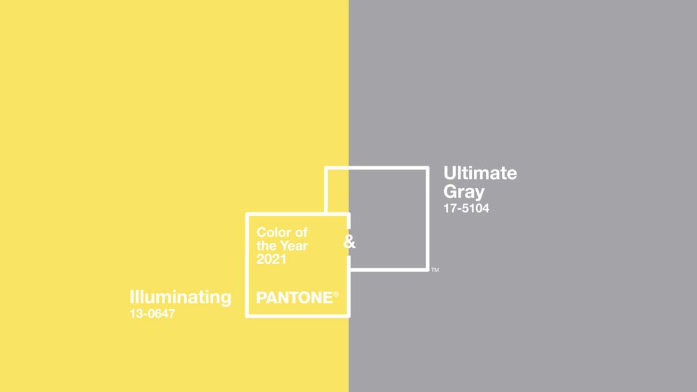

This month, Pantone announced the colors they have chosen as the colors of the year for 2021. They are Ultimate Gray and..
Logo designs convey the company’s value to its target audience. Logo designs evoke emotions in customers and augment w..
A logo isn't just a tiny piece of art or symbol; it's the building block the company is required to build a strong brand..

Whenever there is a discussion about business logo designing, it seems more imperative to take into consideration the tr..